RELATED CATEGORIES: DIGITAL, LOGISTICS

Multi-volume Digital White Paper
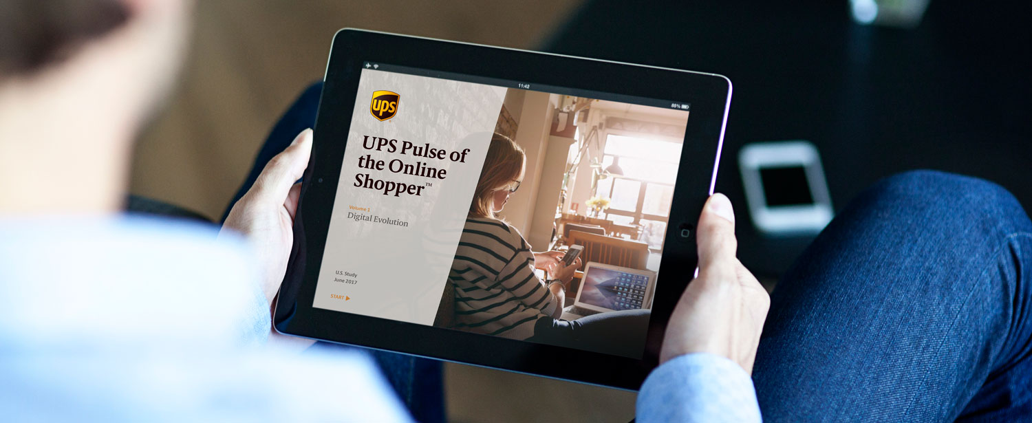
pulse-ipad-mockup
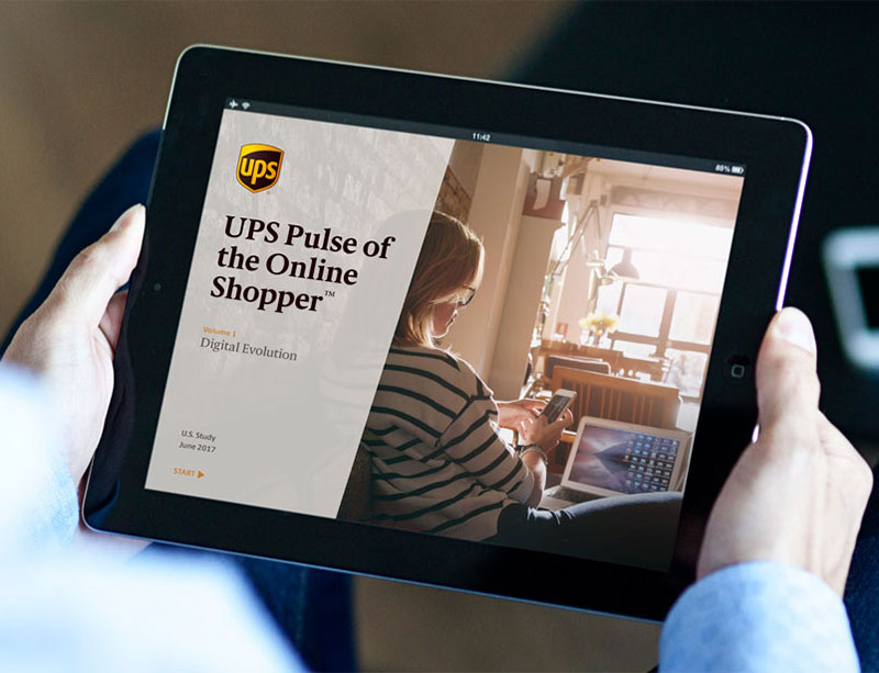
pulse-ipad-mockup-m
pulse-covers
pulse-covers-m

We have to admit that we’re a bit geeky working with quantitative, data-driven material!

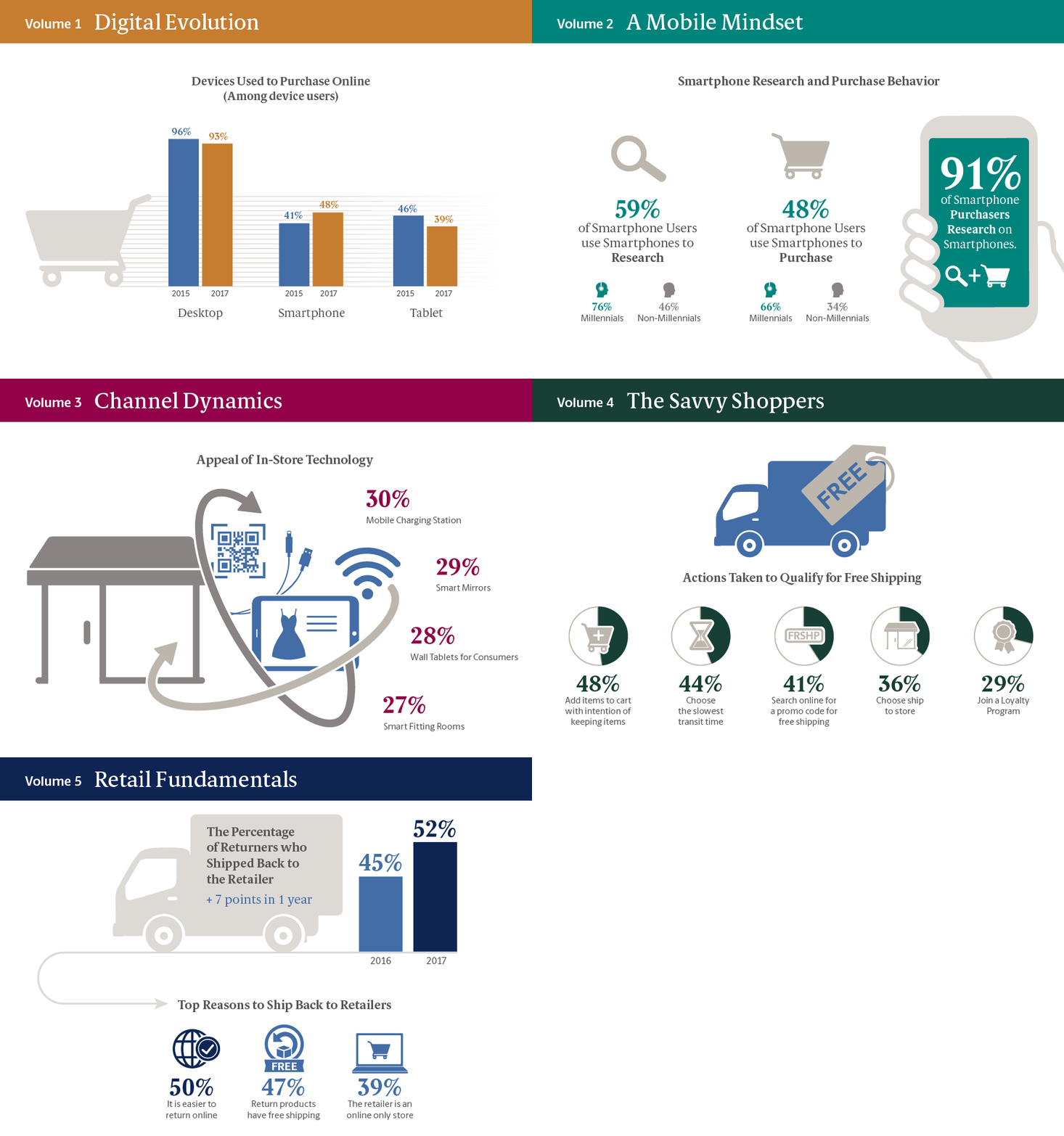
With our imagination and ideas in full force, we helped evolve UPS’s customer-facing study into a nicely digestible “chapter” approach — strategically designed for digital distribution and extended exposure. All five volumes featured nifty iconography, bold landing page headers and intelligent use of layout for content highlights. And, we created a new icon library to promote social media visibility.
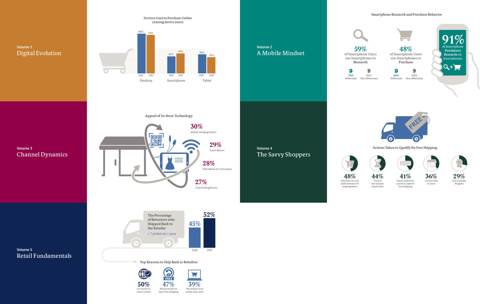
pulse_chapter-graphics
pulse_chapter-graphics-m

Client testimonial

  • When UPS began working with Yellobee on the UPS Pulse of the Online Shopper study materials several years ago, they had already established a reputation within the company for strong design and the ability to translate complex charts and graphs to simple compelling graphics. We were looking to raise the bar and evolve the project, as it had been handled by our research vendor in previous years, but we wanted to strongly brand it as a UPS production, while giving it distinctive visually driven feel of its own. We wanted to move from good to great by developing more impactful graphics while reducing the amount of text.

    Mark Boyles UPS Customer Communications

Custom iconography

pulse_icons
pulse_icons-m